Tuesday, 18 December 2012

Planning The Layout Of The CD Cover And Digipack #1


As I was up to date with my case-studies I had some time inclass today to start thinking about the layout and presentation of the digipackand the advert. I have considered what type of images I should use and thefonts and layouts of the text.
I have decided that I need to use the logo of the band atsome stage of the production of the digipack as I have learned from my casestudies that it is a conventional feature of the work of this band.
At the back they often put the list of songs that arefeatured in the album, therefore I thought that I could choose a number oftheir songs and put them in a list along with the song that I made a video for,I have also noticed that they tend to have symbols that relate to the songs inthe album on the cover rather than photographs of the artists, therefore Ibelieve I should focus on that.
I have decided that I need to focus on a different song fromthe list as my focus point as I thought that if I focus on my song it wouldcreate too much emphasis on it and that is not something that can be seen inany of their albums.

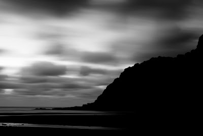
These are some of the images I looked at for inspiration:


Sunday, 16 December 2012

Case Studies (CD, digipack, magazine advert) #9


I have chosen this advert to be a part of my research for the CD pack because it is of the same genre of our song. The font is quite plane which is conventional in this stye of music adverts. It is maintained throughout the page, the only aspect that changes is the size of the font, which I think adds a sense of consistency to the advert and is something that I will need to look very closely at when making one for my own album. the font is white- it is done to maintain the style of the advert which is black&white and the white font also contrasts with the dark background which reinforces the fact that the text is the focus point.
The main parts of the information are written in a large font whereas information which is not as significant but still has to be in the advert is placed at the bottom of the page in white small font. I will try and adapt this technique for my own magazine advert.
The image itself is a full-body shot of the whole band which connotes equality and unity in the band. I like the shot type that is used and will consider using it in my own advert, but I will not incude the whole band because I believe that it should be based on the video we have produced previously and it will therefore only make sense to make it so ony the main singer is in the shot. The artists are all dressed up in clothes reevant and conventioal to the genre which I think is also very usefull in this particular image because it adds to the overal feel of the advert and the message that was intended to be sent, which the reader of the magazine will use as a tool in constructing their initial reaction an opinion of the band as well as the album itself. 

Case Studies (CD, digipack, magazine advert) #8


I have chose this advert as a part of my research into similar products because the genre is the same as our video. The photograph chosen was well thought through because it features a close-up of the artist which adds a personal touch.The photograph itelf Also, it is a clever image composition because it allowed editors to layout the information without interfiering with the face of the artist as only the background is used for that. I will use this technique for my own advert. The fonts used are different for each part of the information which adds character of the band ton the advert. The name of the band is written in the most bold largest font which makes it a focus point. The title of the album is written in a font that was intended to translate some of the mood and emotion of the song and abum to the advert. Lower quartile of the page contains information about the new single and the album, all written in the same font but colours are switched between white and red to connote different sections and make it easy for the reader to folllow. All of the colours that dominate in this page follow with the colour scheme of the album cover which is placed at the bottom of the advert. I will consider incuding the album cover into my own advert.

Case Studies (CD, digipack, magazine advert) #7


I chose this magazine advert as a part of my research for the CD package because of the similarity in genre and the unusual layout of this advert which makes it very useful for my market research.
The image used is symbolical to the genre which is a key factor which I might consider using in my own advert, using a symbol relating to the song to illustrate it, rather than just using the image of the artist. I believe it was done in this case in order to distiguish thuis advert and make it loook unique, which contributes to generating fan interest.
The colour scheme is dark, contrasted with the white font throughout the page, which makes the text focus point of the page, while all other aspects also play a role in creting and transfering the atmosphere of the actual album.
 

Case Studies (CD, digipack, magazine advert) #6


This image was used in a rock magazine for an article about one of their albums. As it is a high angle long shot it makes an impression of power and importance of the band members. It was shot outside as the sky is used as the background, but rather then leaving it in its natural state it was edited via Photoshop to make it darker and more pronounced. Costumes that the artists wear in this image is also conventional as they dress similarly in all the shoots that they appear all together.


Case Studies (CD, digipack, magazine advert) #5

This is a typical photograph used for the adverts in magazines. Differently from the album covers there is also the photographs of the artists rather then symbols. In this particular shot a rough location is used to connote the general style of the band, it is used so that people who don't know about the band would form an initial opinion which then should lead to further interest. The fact that it is a medium shot allows all the members be in shot and seem equal. They are also all wearing similar, dark costumes which are conventional and also used to reinforce the style of the band.


Case Studies (CD, digipack, magazine advert) #4


This is one of the earlier albums of this band. It can be noticed by the layout as after this one over the years their style has changed.
There is a large logo of the band positioned in the upper quarter of the page and the title has been placed at the bottom in a very small plane font.
Background chosen is a photograph of peaceful landscape, which has been made darker to achieve low mood atmosphere which is then reinforced by the songs and choosing this image appeals to the viewer as they build up the expectations and form an initial opinion of it just by looking at the cover.


This is the back cover of this album where the logo appears at the top of the page followed by the list of songs positioned in the centre and the direction of text is also central.
The font used is the same as the one used for the title on the cover which makes it look coherent and consistent.
The image that was used for background is brighter then the one on the cover, while still being of similar style.


Saturday, 15 December 2012

Case Studies (CD, digipack, magazine advert) #3

This is a CD cover of one of the more recent albums of this band. Straight away it is clear that the focus point is the rose in the centre. It was emphasized further by illuminating it to make it look as if it glows which is a very nice idea and helps with the feel that is created.
The rose has been edited via Photoshop to modify it so that it looks more symmetrical and angular which contributes further to the atmosphere. Due to it being related to one of the songs directly it generates additional interest in the album.
The text is positioned at the top of the page and it has been made small to draw the attention away from it and focus on the object.

This is the back of the CD which has all key information smartly laid out in the space available. There is a list of songs, videos and the behind the scenes footage of filming one of the videos.
Font is the same through out the page, however, the colours change as the page is split in two unequal parts where the bright side has a list of songs and the font is dark, at the top of this part there is also the logo of the band which appears on all their albums the only thing that differs is its position, and the other - dark side has bright almost white font which displays all the marketing information, copyrights and the barcode.
I believe that it is a very intelligent layout as every element appears to have its own designated space and is there for a reason, all the space has been used so there is minimal unused blank space which I think I will need to focus on when making my own version of the digipack.
 

Tuesday, 11 December 2012

Music Video Feedback In Class

Today we have showed our music video in class to get some feedback. We received some positive response on narrative, costumes and locations, however, it was noted that our lip-synch was not 100% clear in places.
We got praised on the transitions, colours, layering techniques and other effects we used as it connoted the genre well. However, I consider the lip-synch one of the more serious problems as I agree with the fact that it should have been emphesized more.
Overall, I think it has been useful to hear different opinions and view points on our video. I was also glad to know that we made a conventional video that looked quite genuine.
Audiences appeared to particularly like the girl we used in the video as they identified her to have the right look and acted convincingly too.

Saturday, 8 December 2012

Case Studies (CD, digipack, magazine advert) #2


This advert uses a lot of assumed knowledge as there are no photographs of the artists it is assumed that the viewer will make a connection between the symbol and the artist, as it relates to the image of the vocalist of the band as he often wears feather in his hair when appearing in the videos It is all light with the contrast of dark colours which is quite common feature of many adverts by this band. The positioning of the object on the page is very central which makes it a focus point and emphasizes its importance for the mood of the image. Text is positioned at the bottom of the page to connote that it is not the most important aspect of this advert. However, I believe that it is much easier to relate to this advert only after you have heard the song therefore it reduces the power of advertisement as it is only relevant to the people who watched the video, instead of appealing to a wide range of audiences and attract new people.
At the top of the page there is a logo that appears in all of their adverts. It is important because the viewer can instantly relate the font to the band and therefore a greater effect is achieved rather than if they have put their name in just plane font.
The back cover has a big logo of the band located in the centre, the transparency has been decreased so that it serves as a background for the copyright information which is written in small dark font and also positioned in the centre. The main aspect that stands out to me about this back cover is that the focus point is not the copyright information but the names of band members which are written in bold and positioned at the top of the page.                           


Friday, 7 December 2012

Editing Finally Finished!

Today we have FINALLY completed our music video. I have went through it a couple more times to make sure I was happy with it, and adjusted colour balance in places, video will be uploaded on Monday as today it needed to be exported and also I didn't have a USB stick to put it on. On Monday we will also be doing screanings of our videos to our group to get feedback.

Thursday, 6 December 2012

Editing #8

Today I have used extra time at lunch to contunue with editing of my video. I have almost finished but still have about 1minute to sort ou which I will do tomorrow.
I have added effects like colour adjustments and speed adjustments in places to make it flow better in the overall video.

Wednesday, 5 December 2012

Editing #7

Today was quite a successful day. I have made good progress in editing, got through more then half of the video, pieced together clips, added transitions, adjusted colours and worked on continuity, while doing that I kept an eye on continuity and making sure the story line makes sense. I have worked extra apart from the main lesson today because I need any time I can get because we are a little bit behind everyone else in our class due to finishing filming late, however, today gave me extra sense of confidence that we will finish our video on time because we have made some extra bookings for the editing suite outside of class time to get it done.

Tuesday, 4 December 2012

Editing #6

Today, we have made some great progress in editing our music video. We have added transitions, adjusted colours and fixed the lip-synch for the first minute of our video. We have also reduced speed of the clips in places as we decided that it makes more sense with the pace of our song being quite slow as well. Overall, I believe that we are well on track to finishing our music video by the end of this week.

Monday, 3 December 2012

Editing #5

Today we finally transferred all the necessary footage onto a Mac and started putting together our music video. We got through around 30 seconds of the video: made it black&white, slowed the pace down as we decided that this way it looks better with the genre of music. Also we have started adding transitions in between the shot types. I believe that we made good progress and will be able to finish our music video by the end of this week

Saturday, 1 December 2012

Filming FINALLY Finished!!!!

Today was a great day: we have organized the actors, locations, props and everything and got all our filming done. We had to re-shoot some of the scenes a couple of times to make sure we were completely happy with it but on the whole I believe it went quite well.
Due to the lack of time we had to re-think the idea with the cafe as we were working towards a tight schedule, therefore we decided not to film it and compensate that with an extra scene in the park.
Our actors were amazing: listened and obeyed by what we told them to do, worked efficiently and shown some fantastic acting skills even know none of them are actually studying acting.
I got to be in a part of it as well as when the scene with friends came up we decided that we need more people, therefore it was good that I was prepared as we planned that I would be in the video if the other girl could not come.
As we are really late with this assignment we will work really hard to get all the editing finished in the coming week, I feel that we are really lucky to have such understanding teacher who extended the deadline for us as we had issues with our actors from the start.